Here is the link to my finished site. Check it out!
donaldcorman.com/benzie
Sunday, May 8, 2011
Friday, April 15, 2011
Assignment 8 B: Web Design


Friday, April 1, 2011
Assignment 8: 3 Page Web Design


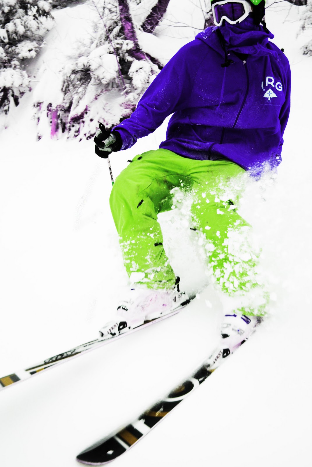
This is my web design. I used my old logo design and played around with the color schemes. I wanted to use colors that were a little more inviting. I used the "SS" as the companies logo symbol, and then placed it in the background of the web pages. I wanted the design to be simple and really visual. I used my own photos that I took of my friend Phil (skier) and my boyfriend (snowboarder) in the design. I still want to work a lot on the layout and on the navigation bar. I would like to incorporate more elements into the design to make the site look more legitimate. I linked each page to all the pages, it is pretty cool to see them all work!
Friday, March 18, 2011
Web Design Navigation Bars
Friday, March 11, 2011
Web Design Sketch

This is just a rough sketch of what I might do for a format. I want it to be simple and have a lot of pictures.
Good Web Designs


These were some web designs that I enjoyed viewing. I think that they work well for many reasons. They are simple, informative, they grab your eye with effective graphic and design principles. I think they are appropriate designs for snowboard companies, their approach to style fits their target audience, which is mainly teenage boys.
Bad Web Designs


I thought that these web designs were bad in different ways. The first one is uninformative, unbalanced, and overall shows no design sense. The second web design has some good qualities but it is too busy. There is too much going one on the welcome page, which makes it difficult to scan through the information.
Friday, March 4, 2011
Assignment 5: Scan/collage


The two other designs I had a lot of fun with. The top design is a play off of scale and proportion. The bottom design was fun and a little surreal. I wanted to make it look like the keys were flying.
Thursday, February 17, 2011
Assignment 4: Photo Adjustments


This is a picture that I took last winter in some glades at Burke. The photo is of my friend Phil. The top image is the original, then sepia w/ color and contrast correction, color w/ contrast healing tool and blur tool, Black and white with contrast correction and hue and saturation with exposure and contrast correction. I had fun with these. I think that the strongest image is the third (color w/contrast correction), and the black and white is the least successful. I had the most fun with the last, hue and saturation! It was fun changing the colors!
Friday, February 11, 2011
Assignment 3: Political Poster

I had a lot of fun with this project. I have never worked with vector in this way. I chose former president Theodore (Teddy) Roosevelt as the featured political figure in the design. The color choices are patriotic and fit the theme of the design. I used a bold, prominent type to add the the strength of the design.
Friday, February 4, 2011
Lessons 04-07 Symmetry

This is some of my work with symmetry. I really wanted to use bright colors so I treated each square as it's own composition.
Saturday, January 29, 2011
Assignment 2: Logo Design
Here are my logo designs. My initials are G.S.B, but I thought that I could come up with a different name for the snow board company. I used Illustrator to create the logo. I used the pen tool and brush tool to draw the gorilla, and the type tool and character window to design and format the type. I have a few different designs, but I like the first design the most.


Friday, January 28, 2011
Assignment 1: American Gothic

For my assignment I decided to choose the painting "American Gothic." It took me a while to figure out which art piece I wanted to re-create. This was my third design, and I thought it was the most successful. I found it challenging to only use rectangles and squares to complete this piece, but I think that the original painting was depicted well through this geometric style. I used the Adobe program Illustrator to complete this project. Illustrator is one of my favorite programs, which was helpful in the designing process.
Saturday, January 22, 2011
Subscribe to:
Posts (Atom)