Thursday, February 17, 2011
Assignment 4: Photo Adjustments
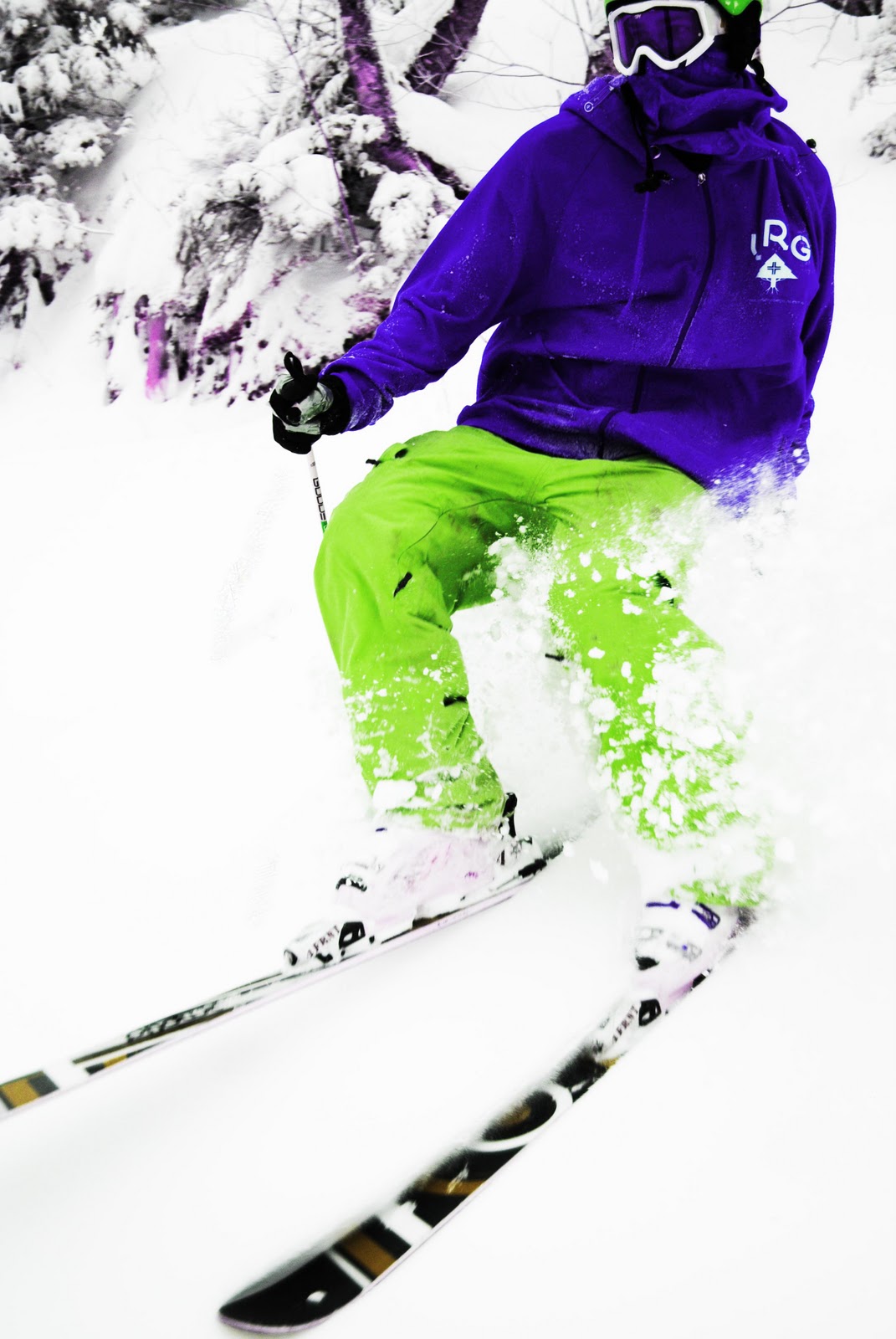
This is a picture that I took last winter in some glades at Burke. The photo is of my friend Phil. The top image is the original, then sepia w/ color and contrast correction, color w/ contrast healing tool and blur tool, Black and white with contrast correction and hue and saturation with exposure and contrast correction. I had fun with these. I think that the strongest image is the third (color w/contrast correction), and the black and white is the least successful. I had the most fun with the last, hue and saturation! It was fun changing the colors!
Friday, February 11, 2011
Assignment 3: Political Poster
I had a lot of fun with this project. I have never worked with vector in this way. I chose former president Theodore (Teddy) Roosevelt as the featured political figure in the design. The color choices are patriotic and fit the theme of the design. I used a bold, prominent type to add the the strength of the design.
Friday, February 4, 2011
Lessons 04-07 Symmetry
This is some of my work with symmetry. I really wanted to use bright colors so I treated each square as it's own composition.
Subscribe to:
Posts (Atom)