Friday, March 18, 2011
Web Design Navigation Bars
Here are some ideas for navigation bars. I wanted the colors to correspond with my logo design. I played around with rounded rectangles, bevels etc. I will probably work on this more for my final web comp. So far my favorites are the gray and the blue bars.
Friday, March 11, 2011
Web Design Sketch
This is just a rough sketch of what I might do for a format. I want it to be simple and have a lot of pictures.
Good Web Designs
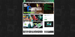
These were some web designs that I enjoyed viewing. I think that they work well for many reasons. They are simple, informative, they grab your eye with effective graphic and design principles. I think they are appropriate designs for snowboard companies, their approach to style fits their target audience, which is mainly teenage boys.
Bad Web Designs
I thought that these web designs were bad in different ways. The first one is uninformative, unbalanced, and overall shows no design sense. The second web design has some good qualities but it is too busy. There is too much going one on the welcome page, which makes it difficult to scan through the information.
Friday, March 4, 2011
Assignment 5: Scan/collage
The first image is a collage of all the objects that I scanned. I arranged them in a way to make them their own design. I changed them to a grey-scale color mode to make them look like an old photograph. The theme is what someone might find on their grandmothers side table.
The two other designs I had a lot of fun with. The top design is a play off of scale and proportion. The bottom design was fun and a little surreal. I wanted to make it look like the keys were flying.
Subscribe to:
Comments (Atom)


